→ 03 Brand Strategy
System & Soul
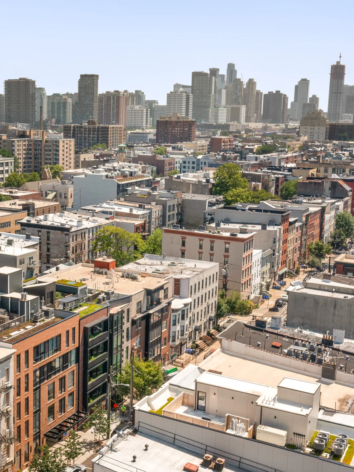
WOO’s research found a market built on a false choice. Buyers in the New York and New Jersey metro were asked to pick city life or suburban space, and a study of 15 competitors across five tiers found nobody offering both. National builders had scale and little soul, while the boutique architects who had soul could not scale. The team named the buyer caught in the middle the Urban Villager: a design-conscious professional who wants a solid, efficient home in a walkable town with a real center. WOO answered them with a positioning called System & Soul. Matt carries the System, meaning the data, the field work and the conversation with investors. Buyers hear the Soul from Colleen, who designs the homes and the life inside them.
→ 04 Art Direction
Arcology
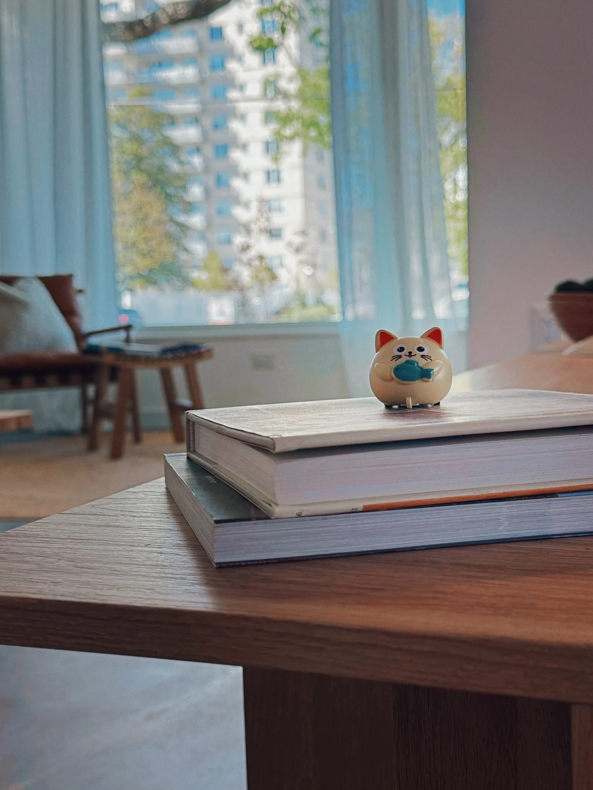
To carry System & Soul in one message, WOO built the art direction on the philosophy behind Arcosanti, the town in the Arizona desert designed so that architecture and ecology work as one living organism. Its contemporaries shared the conviction: Japan’s Metabolists drew cities that grow like living cells, and Ian McHarg’s Design with Nature put the land before the plan. Weighted at 60 percent, the Sage archetype set the System side with clean layouts, generous negative space, deep forest green and charcoal. The Creator took the other 40 and brought the Soul through a terracotta accent and the photography. For photographers the brief asked for warm, candid frames close to documentary, on film when possible, with natural light on honest materials.

→ 05 Logo
Tree of Life
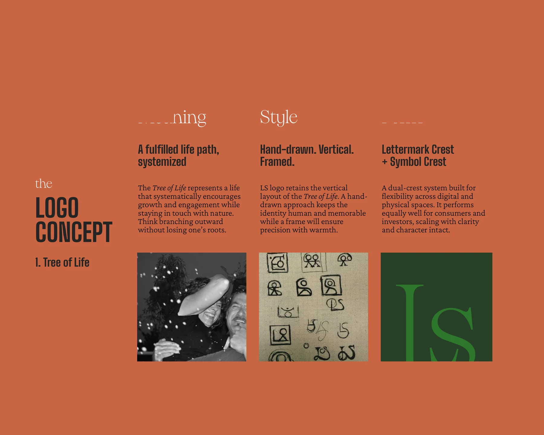
In almost every ancient civilization, the Tree of Life links earth, human life and the cosmos. WOO traced it through logic, biology, mathematics and the town plans of Arcosanti before drawing a single line, and wrote the concept as a fulfilled life path, systemized. Branch outward without losing your roots. The marks are hand-drawn, vertical and framed, so the frame brings the precision and the hand keeps the warmth. Early versions sat in squares. The final system is a dual crest: an LS lettermark and a tree symbol, each inside a drawn circle, built to work for buyers and investors, on paper and on screen. Every choice followed Raymond Loewy’s rule of Most Advanced Yet Acceptable, set at 70 percent familiar and 30 percent new.



→ 06 Illustration
Time Spent Well
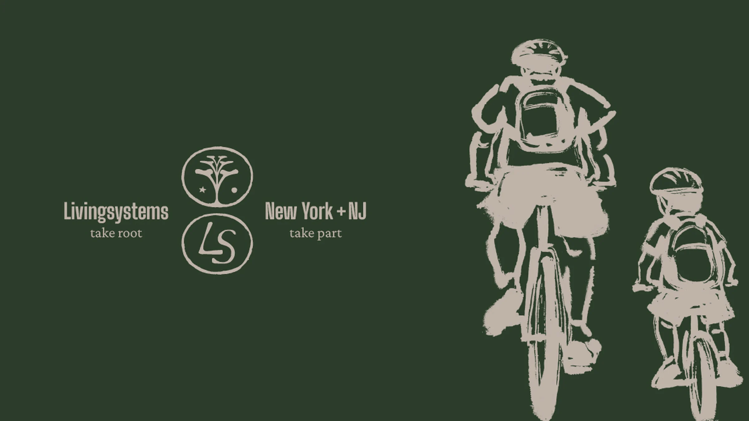
Developers sell homes before anyone lives in them, and the industry usually fills that gap with renders. WOO filled it with ink. Each illustration puts human irregularity into an otherwise precise architectural language: a father and son cycling, a man walking his dog, a long kitchen table set for a crowd. The father and son carry the brand’s line on technology. A headline asks what good tech is, really, and the copy answers that Livingsystems uses it to simplify energy use and daily upkeep, so the hours go to family and presence instead. On the dark social image, the same pair rides past the two crests, drawn in pale sand on deep green.
→ 07 Icons
Two Houses
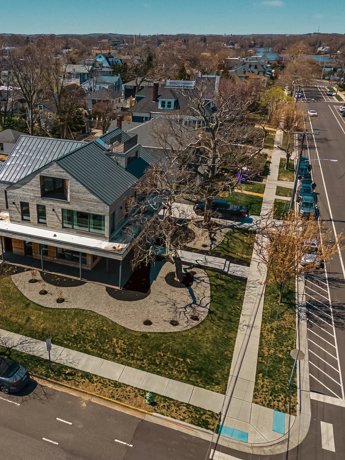
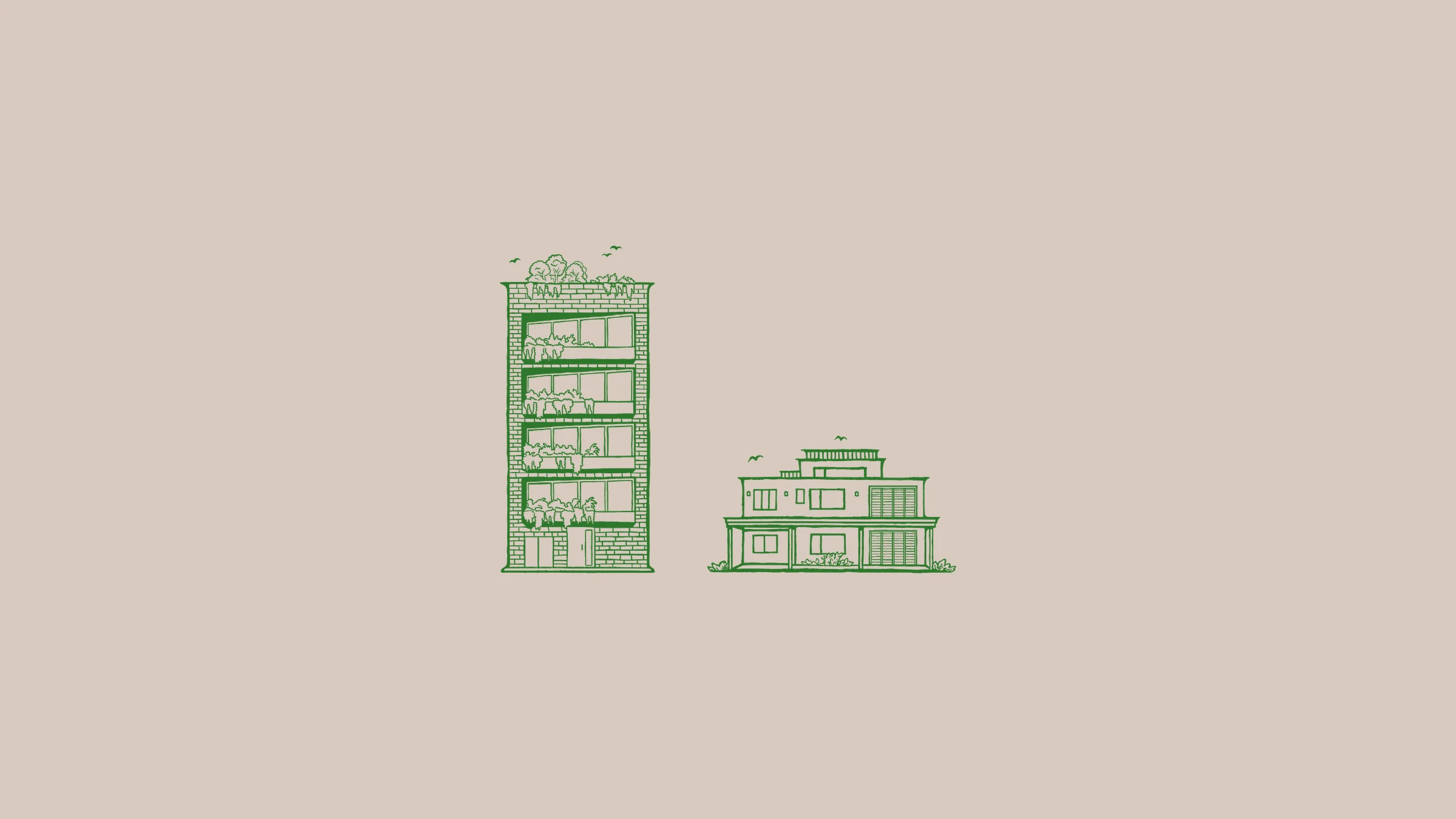
The identity deck is dated January 22, 2026. By then Livingsystems had two homes to its name, and WOO drew both in the same green ink. UX-413 in Hoboken rises in brick, with window boxes on every floor, planting on the roof and a few birds above it. UX-500 in Asbury Park sits lower and wider, with a roof terrace and a deep porch. The drawings follow the rule written for every icon in the system, organic precision: an architect’s line with the wobble of a hand left in. In the type section of the same deck, Big Shoulders was tested on a single sentence, set large in green. UX413 was just the beginning.
→ 08 Tagline
Take Root
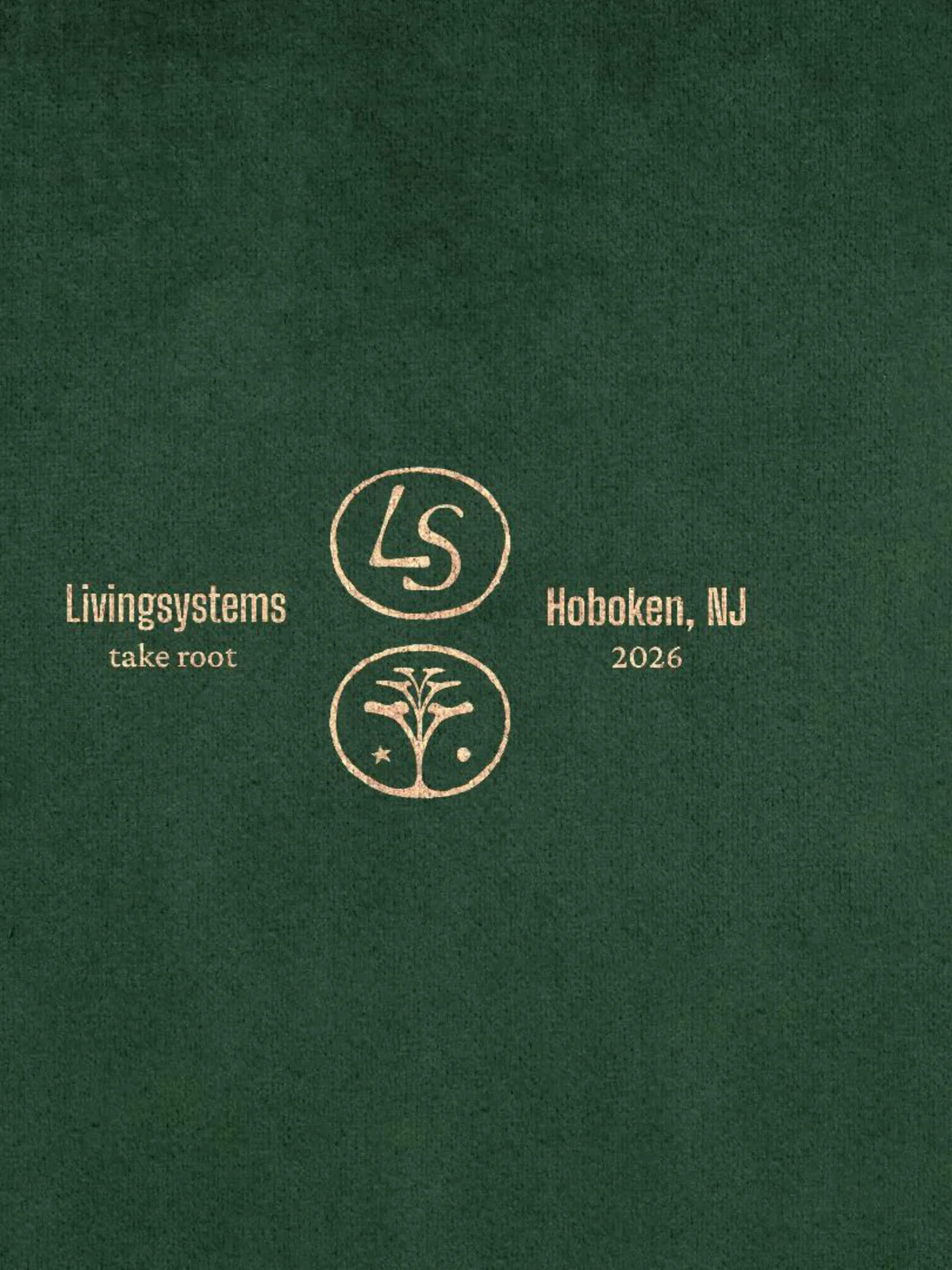
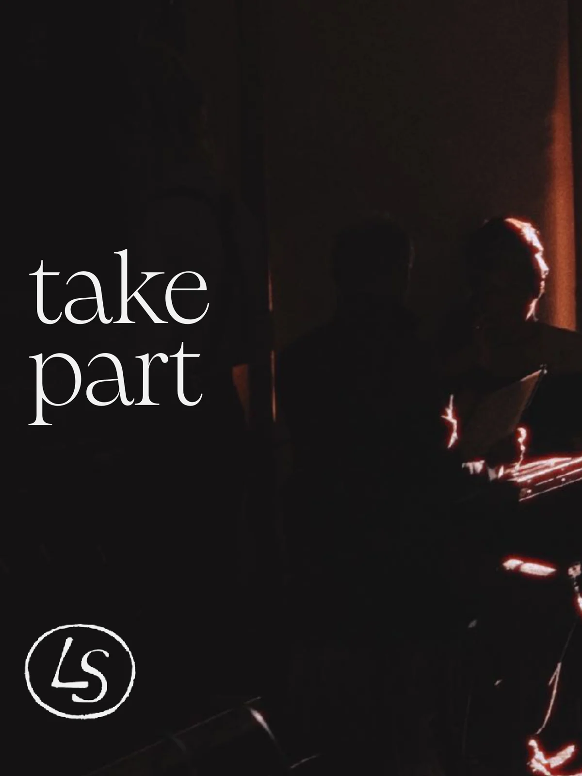
The tagline is two words, take root. It promises permanence and belonging, and the verb is allowed to change with the audience while the idea stays put. Over the shadow of a plant on a warm wall, it becomes take solace. A street of outdoor tables in low sun gets take part. LS Studio, the consultancy arm that advises developers and hospitality brands, gets take form. On the website, the main line sits in the footer above a hand-painted green root, the last thing a visitor sees. The full lockup reads Livingsystems, take root, Hoboken, NJ, 2026, with the two crests stacked between the words.


→ 09 Looking Back
Tell It
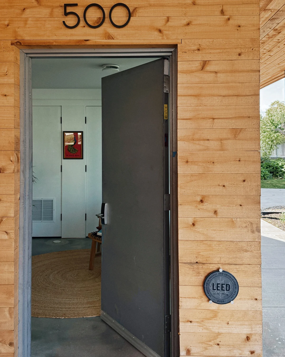
In the first session, on September 25, 2025, Matt made the case for education. Buyers judged homes by perceived space, and the real quality of a Livingsystems build often went unseen. Oli agreed, with a caveat that shaped the rest of the work: a pioneer in living should tell, and let the audience follow. The brand book took that to heart. Its Hype Glossary defines modern luxury as a phrase used to justify cheap materials and grey paint sold at a premium. At UX-500 the same argument takes the form of a round LEED plaque on the timber wall by the front door, a few feet below the house number.