→ 01 The world of
Innerprise
→ 01 The world of
Innerprise
Innerprise is a growth partner for founders, run by Dieuwke van Woensel in Rotterdam. What makes the business stand out in an ocean of coaching fluff is its honest no-nonsense format. WOO gave Dieuwke's practice a new name, a strategy, a voice and a hand-drawn identity, as well a website, relaunching her practice to coincide with the publication of her first book.
Innerprise is a growth partner for founders, run by Dieuwke van Woensel in Rotterdam. What makes the business stand out in an ocean of coaching fluff is its honest no-nonsense format. WOO gave Dieuwke's practice a new name, a strategy, a voice and a hand-drawn identity, as well a website, relaunching her practice to coincide with the publication of her first book.
Dieuwke works with founders on the gritty and often not talked about parts of running a business: self-doubt, control, and the discrepancy between who someone is and who they think they must become to lead successfully. Dieuwke's background is in HR. Having worked with family businesses for years taught her to see stakeholders in any project as people first. She believes that only then one can see the personal grit being an entrepreneur entails, which then opens the door for conversation and growth.
·
Brand Identity
·
Go-to-market Strategy
·
Web Design
·
Copywriting
·
Communication Strategy
→ 01 The world of
Innerprise
Innerprise is a growth partner for founders, run by Dieuwke van Woensel in Rotterdam. What makes the business stand out in an ocean of coaching fluff is its honest no-nonsense format. WOO gave Dieuwke's practice a new name, a strategy, a voice and a hand-drawn identity, as well a website, relaunching her practice to coincide with the publication of her first book.
Dieuwke works with founders on the gritty and often not talked about parts of running a business: self-doubt, control, and the discrepancy between who someone is and who they think they must become to lead successfully. Dieuwke's background is in HR. Having worked with family businesses for years taught her to see stakeholders in any project as people first. She believes that only then one can see the personal grit being an entrepreneur entails, which then opens the door for conversation and growth.
·
Brand Identity
·
Go-to-market Strategy
·
Web Design
·
Copywriting
·
Communication Strategy

→ 02 Presenting
WOO ᕁ Innerprise
→ 02 Presenting
WOO ᕁ Innerprise
Dieuwke and WOO met through Smlin, a good-doer founder collective founded by WOO client Florent Coudyser. Her practice was called GrowthSpace then. Growthspace still promised HR on paper. Though her 1:1 work with founders was revealing one single theme that repeated in almost every case: clients wanted their business to grow but they had a hard time viewing their mental state as an essential part of that story. So she began asking what would make a founder pay for the inner work? Both in money and in time, the latter carrying much more significance.
Dieuwke and WOO met through Smlin, a good-doer founder collective founded by WOO client Florent Coudyser. Her practice was called GrowthSpace then. Growthspace still promised HR on paper. Though her 1:1 work with founders was revealing one single theme that repeated in almost every case: clients wanted their business to grow but they had a hard time viewing their mental state as an essential part of that story. So she began asking what would make a founder pay for the inner work? Both in money and in time, the latter carrying much more significance.

→ 03 Brand Strategy
I + We
WOO kicked off the partnership with 3 long, in-depth interviews with Dieuwke. By the end of it, she said she felt seen, and the new brand had its starting point from there. After conducting a brief market research, WOO found out that trust in the effectiveness of the consultancy solutions was at a record low. Blending the finding with the output of the in-depth session, the team started writing down alternative statements that articulated the core value of Dieuwke's practice. This would form the foundation of the new brand. After a few iterations, one statement stood out: a founder can not grow an enterprise without growing themselves. In other words, the inner work was an essential for the outer work to succeed. That one phrasing led to the idea of finding a name starting with an “I”. A founder who leads a team, builds a culture or grows a company works at the level of “we,” and WOO’s position was that the “we” only works once the “i” work is done.
WOO kicked off the partnership with 3 long, in-depth interviews with Dieuwke. By the end of it, she said she felt seen, and the new brand had its starting point from there. After conducting a brief market research, WOO found out that trust in the effectiveness of the consultancy solutions was at a record low. Blending the finding with the output of the in-depth session, the team started writing down alternative statements that articulated the core value of Dieuwke's practice. This would form the foundation of the new brand. After a few iterations, one statement stood out: a founder can not grow an enterprise without growing themselves. In other words, the inner work was an essential for the outer work to succeed. That one phrasing led to the idea of finding a name starting with an “I”. A founder who leads a team, builds a culture or grows a company works at the level of “we,” and WOO’s position was that the “we” only works once the “i” work is done.


→ 04 Art Direction
Ballpoint Blue
Once the name was found, the team started work on the art direction. WOO proposed anchoring the brand in a tool every founder already owns to convey familiarity and trust, decided on the blue ballpoint pen. Once Dieuwke was on board, the choice set the tone for the rest of the identity, inclduing color. Primary Blue brings the rigour, with Ochre Spark, a warm yellow, for calls to action and Deep Olive for text. In the art direction, the visual language splits between two brand archetypes. The Sage gets the ink, with ballpoint drawings for storytelling and big moments. For icons and bullet points, the Jester got represented through cutout shapes in the spirit of Matisse (see below).
Once the name was found, the team started work on the art direction. WOO proposed anchoring the brand in a tool every founder already owns to convey familiarity and trust, decided on the blue ballpoint pen. Once Dieuwke was on board, the choice set the tone for the rest of the identity, inclduing color. Primary Blue brings the rigour, with Ochre Spark, a warm yellow, for calls to action and Deep Olive for text. In the art direction, the visual language splits between two brand archetypes. The Sage gets the ink, with ballpoint drawings for storytelling and big moments. For icons and bullet points, the Jester got represented through cutout shapes in the spirit of Matisse (see below).


→ 05 Illustration
By Hand
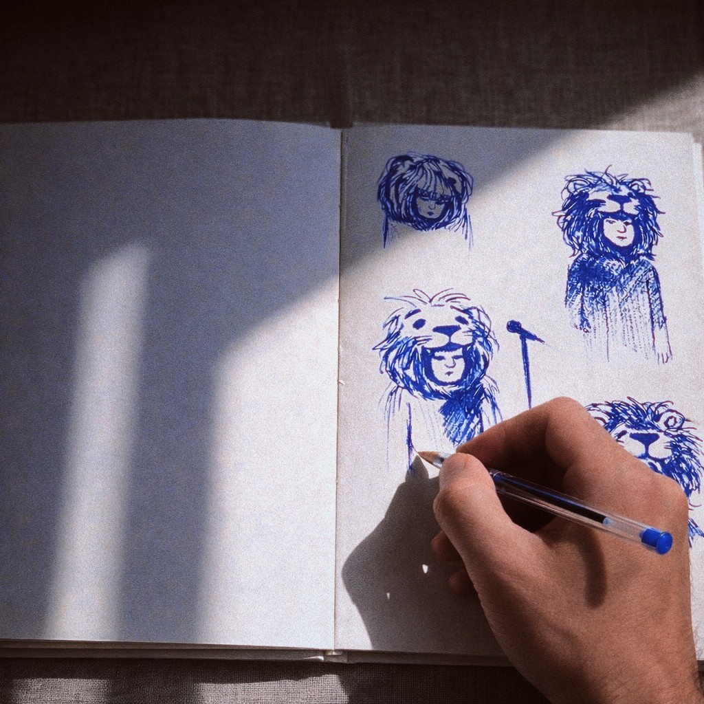
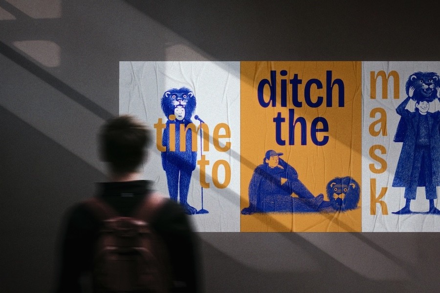
WOO drew a series of illustrations by hand in ballpoint, one for each phase a founder moves through on the way to leading well. A founder in a lion suit stands at a microphone for the cult of crushing it. In the drawing for flaw-some growth, the lion head comes off. Another founder clutches a receipt that runs to the floor, and someone else opens a briefcase that spills the letters of the brand name. On the website the drawings appear on graph paper with handwritten captions. WOO kept the jitter of the hand in every line, because the brand argues for imperfection and the drawings had to make that case first.
WOO drew a series of illustrations by hand in ballpoint, one for each phase a founder moves through on the way to leading well. A founder in a lion suit stands at a microphone for the cult of crushing it. In the drawing for flaw-some growth, the lion head comes off. Another founder clutches a receipt that runs to the floor, and someone else opens a briefcase that spills the letters of the brand name. On the website the drawings appear on graph paper with handwritten captions. WOO kept the jitter of the hand in every line, because the brand argues for imperfection and the drawings had to make that case first.





→ 06 Brand Identity
The Dot
WOO drew the logo around a single dot. The brand calls it the inner circle, “the center every founder searches for in the chaos.” A loose hand writes the wordmark, and the dot works alone as the icon on social profiles and in the browser tab. Headlines run in a lively grotesque, body copy in a bookish serif. For margin notes there is a handwriting face that the art direction calls the editor of the brand. The textures stay rough and the margins wide, so every page reads like a desk mid-project. That is the same imperfection the illustrations argue for.
WOO drew the logo around a single dot. The brand calls it the inner circle, “the center every founder searches for in the chaos.” A loose hand writes the wordmark, and the dot works alone as the icon on social profiles and in the browser tab. Headlines run in a lively grotesque, body copy in a bookish serif. For margin notes there is a handwriting face that the art direction calls the editor of the brand. The textures stay rough and the margins wide, so every page reads like a desk mid-project. That is the same imperfection the illustrations argue for.


→ 07 Copywriting
The Jester
WOO built the voice on archetypes: the Sage, the Caregiver and the Jester. Dieuwke had first picked the Caregiver and the Hero. WOO kept the warmth, let go of the Hero and handed the Jester the microphone. The result is mostly Sage, with a streak of Jester and a touch of Caregiver. Every line answers to a golden rule: “Is it true? Is it human? Does it have a pulse?” Working through the archetypes also gave Dieuwke the words for what her brand stands for. A postcard sums it up: “Humble-bragging on LinkedIn never works. But there is something you can do to grow.”
WOO built the voice on archetypes: the Sage, the Caregiver and the Jester. Dieuwke had first picked the Caregiver and the Hero. WOO kept the warmth, let go of the Hero and handed the Jester the microphone. The result is mostly Sage, with a streak of Jester and a touch of Caregiver. Every line answers to a golden rule: “Is it true? Is it human? Does it have a pulse?” Working through the archetypes also gave Dieuwke the words for what her brand stands for. A postcard sums it up: “Humble-bragging on LinkedIn never works. But there is something you can do to grow.”


→ 08 Web Design
Proof of Method
WOO built theinnerprise.com to balance the story with the sale. A visitor first sees how seriously Dieuwke takes her work, and the booking options come later. The homepage opens on “From friction to focus” and a founder with the dot perched on one finger. A section called Fifty Shades of Beige pokes at the coaching industry. Each step of the Un-work gets a drawing and a plain paragraph. A parody “Flawless Founder” report promises absurd growth. The offers come last, from a short growth check-in to a full team programme.
WOO built theinnerprise.com to balance the story with the sale. A visitor first sees how seriously Dieuwke takes her work, and the booking options come later. The homepage opens on “From friction to focus” and a founder with the dot perched on one finger. A section called Fifty Shades of Beige pokes at the coaching industry. Each step of the Un-work gets a drawing and a plain paragraph. A parody “Flawless Founder” report promises absurd growth. The offers come last, from a short growth check-in to a full team programme.

→ 09 Production
The Relaunch
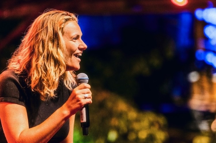
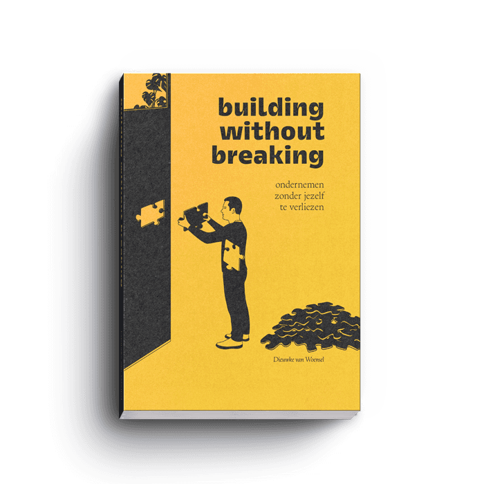
Dieuwke relaunched the brand with an evening in Rotterdam built around her book. Copies of Building Without Breaking waited in stacks beside yellow bags and a sign that read “Get your copy.” The Dutch subtitle, ondernemen zonder jezelf te verliezen, means building a business without losing yourself. Guests wrote on paper notes and stuck them to a tiled wall, gathered on the floor for the talk and read the first pages standing up. Dieuwke took the microphone, then signed books in the middle of the crowd. WOO came with a camera, for the evening and for portraits of Dieuwke among her readers.
Dieuwke relaunched the brand with an evening in Rotterdam built around her book. Copies of Building Without Breaking waited in stacks beside yellow bags and a sign that read “Get your copy.” The Dutch subtitle, ondernemen zonder jezelf te verliezen, means building a business without losing yourself. Guests wrote on paper notes and stuck them to a tiled wall, gathered on the floor for the talk and read the first pages standing up. Dieuwke took the microphone, then signed books in the middle of the crowd. WOO came with a camera, for the evening and for portraits of Dieuwke among her readers.


Next ⟶
Next ⟶
Next ⟶